
Color Psychology in Branding: What's Real, What's Not
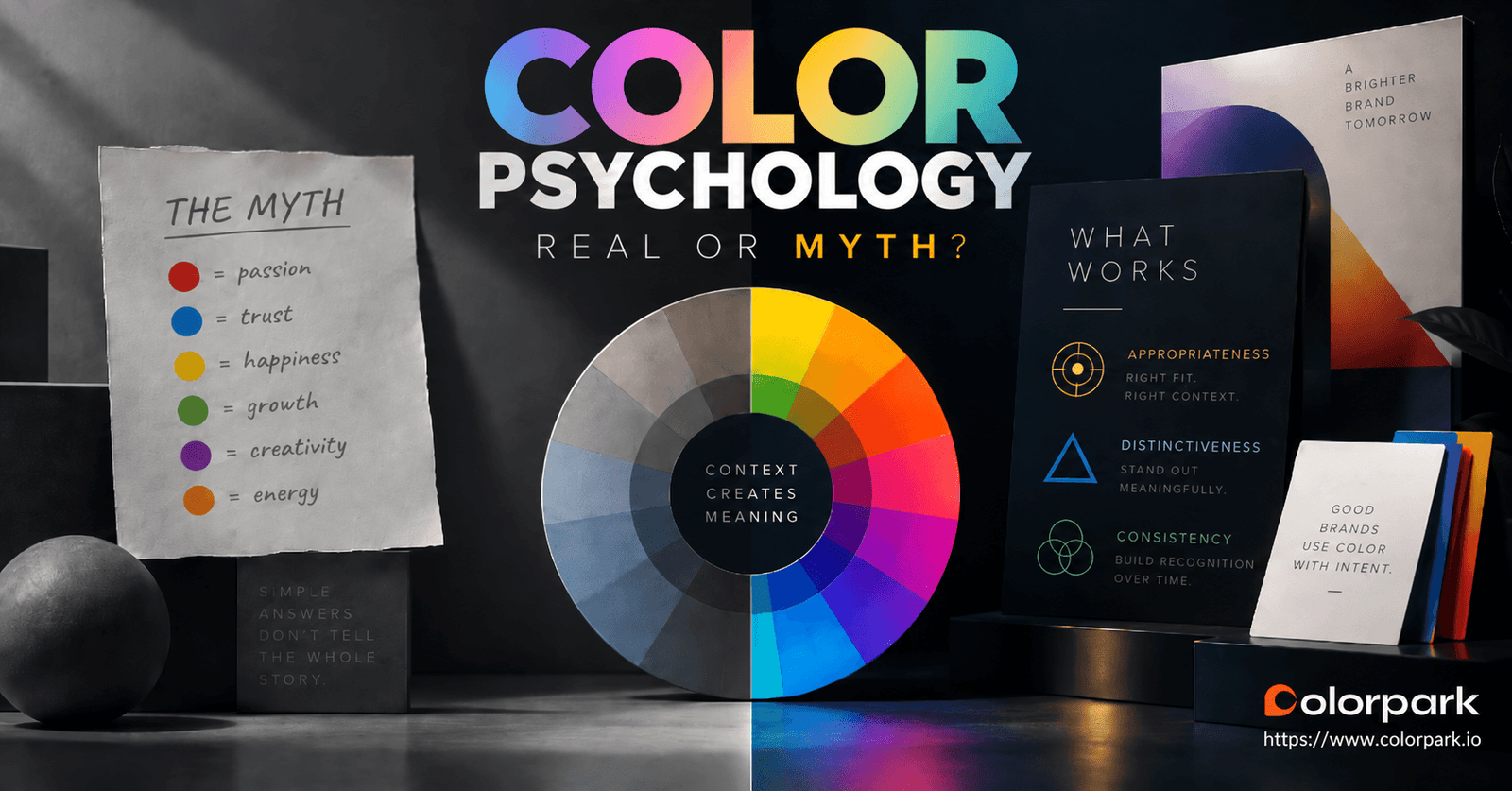
Red means urgency. Blue means trust. Green means nature. Black means luxury.
You have probably seen a branding chart that makes color psychology look this simple.
The problem is not that color has no psychological effect. Research suggests that color can influence perception, brand personality, evaluation, memory, and even behavior in certain contexts.
The problem is turning those findings into universal rules.
A blue logo does not automatically make a company trustworthy. A red button does not guarantee urgency. Black does not transform an ordinary brand into a luxury one.
Color psychology in branding is real, but context determines what the color actually does.
For a brand, the better questions are:
- Does this color fit the positioning?
- Does it help the brand stand apart from realistic competitors?
- Will customers learn to associate it with the brand over time?
- Can the palette work consistently across digital, print, accessibility, and product interfaces?
Those questions produce more defensible brand decisions than a color-to-emotion chart.
What Is Color Psychology in Branding?
Color psychology in branding examines how color can affect the way people perceive, interpret, remember, and respond to a brand.
That includes more than emotion.
Color can contribute to perceptions such as:
- competence;
- excitement;
- sophistication;
- familiarity;
- product fit;
- status;
- visual distinctiveness.
But those effects do not happen independently of everything else.
A customer sees color together with typography, product category, price, packaging, imagery, language, previous experience, culture, and the situation in which the brand appears.
A 2014 review in the Annual Review of Psychology concluded that color can affect human cognition, emotion, and behavior, while also warning that important boundary conditions and questions about real-world generalizability remain. That is a much more useful starting point than assuming every hue carries a fixed psychological instruction.
The Problem With Brand Color Meaning Charts
A typical chart might tell you:
| Color | Popular branding interpretation |
|---|---|
| Red | Energy, passion, urgency |
| Blue | Trust, security, calm |
| Green | Nature, health, growth |
| Yellow | Optimism, happiness |
| Purple | Creativity, royalty |
| Black | Luxury, sophistication |
These associations are not completely invented.
Research has found relationships between certain colors and particular perceptions under controlled conditions. Labrecque and Milne, for example, studied how hue, saturation, and value can influence perceived brand personality. Their work linked red more strongly with excitement and blue with competence in the contexts they tested.
The mistake comes one step later:
Blue was associated with competence in a study, therefore blue means trust for every brand.
That conclusion is too broad.
Consider how differently the same color can function.
Red appears across Coca-Cola, Netflix, YouTube, Target, and many unrelated brands.
Green appears in financial services, food, technology, energy, entertainment, and environmental organizations.
Black can represent luxury in one context and pure utility in another.
The hue contributes to the impression, but the surrounding brand system teaches people how to interpret it.
Is the Famous "90% of First Impressions Come From Color" Statistic True?
This is one of the most repeated statistics in branding content.
The actual wording deserves more care.
Satyendra Singh's 2006 paper Impact of Color on Marketing reviewed earlier color research and stated that people can make initial judgments about people or products within 90 seconds and that approximately 62–90% of that assessment may be based on color alone.
That is not the same as saying:
"90% of all first impressions of a brand are caused by its logo color."
The original paper presents a range, discusses people and products, and is itself a review of earlier literature rather than evidence for a universal branding law.
So should a branding team use the 90% statistic in a client presentation?
ColorPark's recommendation is no.
Not because color is unimportant, but because the simplified internet version claims more certainty than the evidence supports.
A good branding argument does not need it.
What About the Claim That Color Increases Brand Recognition by 80%?
Another popular claim says color can increase brand recognition by as much as 80%.
You will find the number repeated across marketing blogs, infographics, agency presentations, and social posts.
What is much harder to find is a clearly traceable primary academic study establishing that number as a general rule across brands.
That is enough reason to avoid presenting it as settled research.
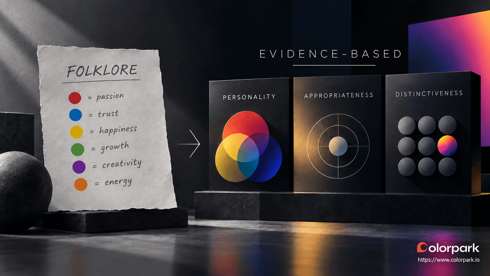
There is legitimate evidence connecting color with brand memory and recognition, but the relationship is more nuanced.
For example, a 2013 study using familiar food and beverage logos found that familiarity influenced the way participants perceived and remembered canonical brand colors. Strongly familiar brands showed a measurable memory-color effect that less familiar brands did not.
That finding leads to a more useful conclusion:
Color can become a powerful memory cue when a brand builds a consistent association with it over time.
That is different from claiming that simply adding color produces an automatic 80% recognition lift.
What the Research Actually Tells Us About Brand Colors
Once the viral statistics are removed, several useful principles remain.
1. Color Can Influence Brand Personality
Labrecque and Milne examined color across four studies and found that hue, saturation, and value can affect consumer perceptions of brand personality, likability, familiarity, and purchase intention.
That means color is strategically relevant.
But notice that the research looks beyond hue alone.
The difference between a muted navy and an electric blue matters. So does brightness, saturation, context, and the rest of the identity.
A brand team should therefore ask:
What impression does this complete palette support?
Not simply:
What does blue mean?
2. Appropriateness Matters
One of the most useful branding studies comes from Paul Bottomley and John Doyle.
Their experiments examined the perceived appropriateness of logo colors across different product types and positioning strategies.
They found that people evaluated colors partly according to how congruent those colors appeared with the product and the positioning being communicated.
This changes the branding question.
Do not begin with:
Which color represents trust?
Begin with:
Which visual direction feels credible for what this specific brand promises to this specific audience?
A bold orange identity may work beautifully for one financial product and feel wrong for another.
The answer comes from positioning and context, not from the hue in isolation.
3. Familiarity Builds Color Associations
Strong brands teach customers what their colors mean.
That learning happens through repetition.
When the same color appears consistently across packaging, advertising, interfaces, signage, social content, and customer touchpoints, the visual cue can become increasingly associated with the brand.
Research into familiar logos supports the connection between brand familiarity and memory for canonical color.
This explains an important branding principle:
Consistency can become more valuable than constantly searching for a theoretically "better" color.
4. Context Can Change the Result
Color effects can change according to the environment in which the color appears.
That remains visible even in newer research.
A 2026 study in the Journal of Retailing and Consumer Services examined black-and-white versus colored logos across six studies involving 2,274 participants. In those study conditions, black-and-white logos increased perceived brand status through perceived "coolness," while factors including familiarity and perceived warmth affected the relationship.
The useful lesson is not:
Black-and-white logos are better.
That would repeat exactly the mistake color-meaning charts make.
The useful lesson is that color effects depend on what is being judged, who is judging it, and the associations created by the surrounding context.
A Better Framework for Choosing Brand Colors
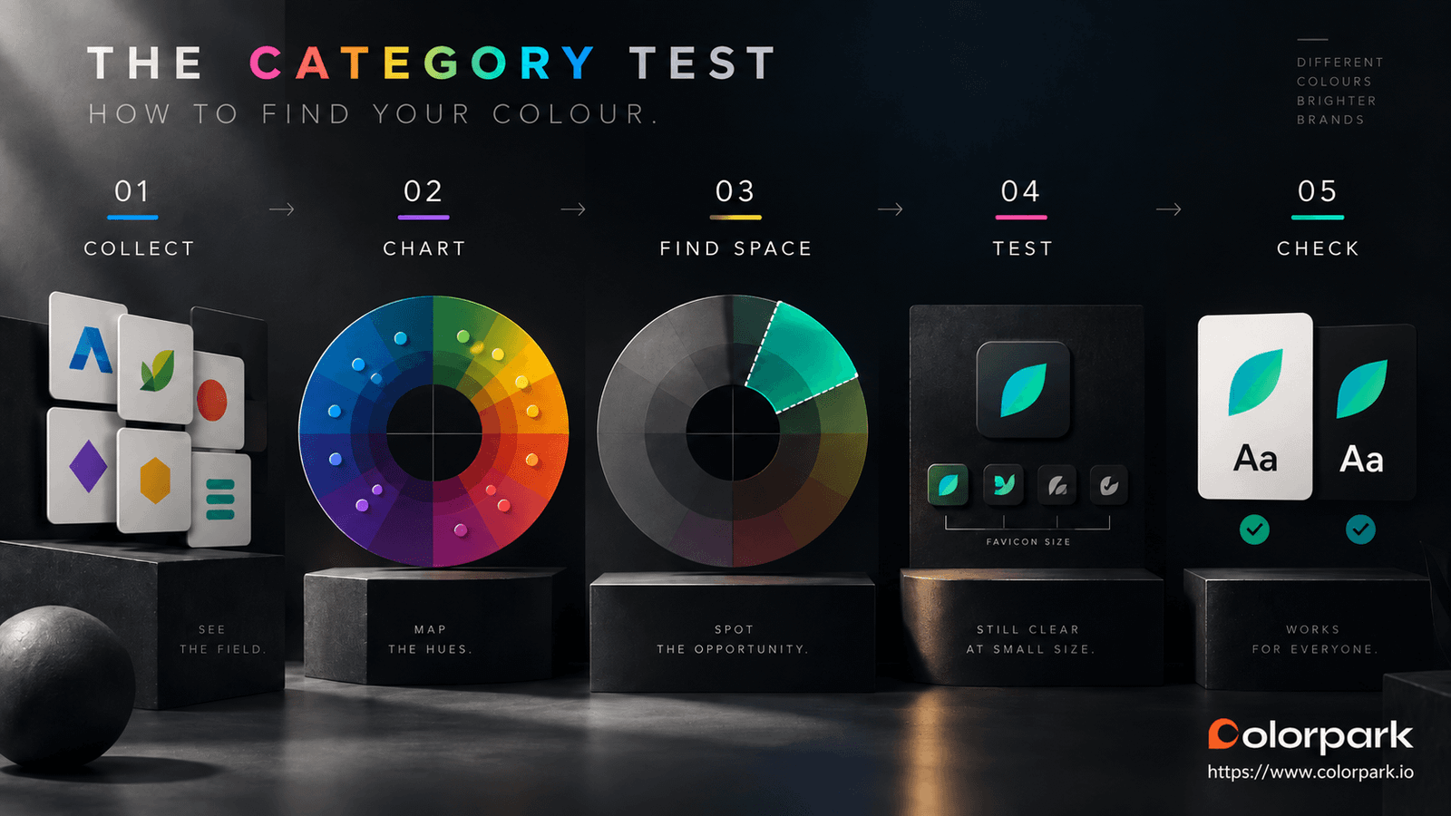
When ColorPark evaluates a palette, the goal is not to identify a magical color.
The goal is to find a visual system that supports the positioning, separates the brand from relevant alternatives, works across real interfaces, and can be applied consistently.
Here is a practical way to do that.
Step 1: Define What the Customer Needs to Believe
Before opening a color picker, write down the most important perception the brand must create.
For example:
"This team understands complex enterprise problems."
"This product is simple enough to use without training."
"This is a premium product worth paying more for."
"This company feels energetic without looking childish."
These are more useful than abstract internal values such as "innovation" or "excellence."
Now evaluate the palette against the actual positioning.
Does the visual language support the promise or make the brand work harder to explain itself?
Step 2: Audit the Competitive Environment
Collect the brands a customer would genuinely compare with yours.
Look beyond direct competitors if another company shapes visual expectations in the category.
Record:
- primary colors;
- secondary colors;
- logo treatment;
- typography;
- dominant background colors;
- interface or packaging style.
Then view them together.
You may discover that a category strongly favors certain visual conventions.
That information matters because differentiation only exists relative to something else.
Step 3: Look for Distinctiveness Without Chasing Difference for Its Own Sake
Being different is not automatically good.
A strange color chosen only because competitors are not using it can make a brand more noticeable while simultaneously making it less appropriate.
The useful territory sits between two failures:
Too familiar: The brand disappears into the category.
Too disconnected: The brand stands out but sends the wrong signal.
The goal is recognizable difference that still makes sense for the offer and audience.
Step 4: Test the Color in Real Brand Touchpoints
Do not approve a palette from a large rectangle on a moodboard.
Test it where customers will actually encounter it.
That might include:
- website header;
- mobile interface;
- favicon;
- social avatar;
- proposal cover;
- packaging;
- sales presentation;
- email;
- advertising creative;
- dark mode.
A color that looks distinctive across a full-screen presentation may become almost indistinguishable from competitors at favicon size.
This is the same reason interface elements should be tested at their actual dimensions rather than evaluated only on a design canvas. Our practical icon size guidelines explore that principle in UI design.
Step 5: Test Accessibility Before Finalizing the Palette
Accessibility should influence the system early, not after the brand identity is finished.
There is an important distinction here.
WCAG 2.2 does not require text that forms part of a logo or brand name to meet the standard text-contrast ratio. Logotypes are specifically exempt from that requirement.
However, once the same brand color is used for body text, buttons, links, form controls, or other functional interface elements, accessibility requirements become relevant. WCAG 2.2 specifies a minimum contrast ratio of 4.5:1 for normal text and 3:1 for large text at Level AA. It also says color should not be the only visual method used to communicate information or an action.
So instead of asking:
Does our logo color pass accessibility?
Ask:
Have we designed accessible combinations for every functional way this color will be used?
A complete palette should define those combinations before development begins.
Step 6: Build Rules That Keep the Color Consistent
Choosing the color is only the beginning.
Define:
- primary color values;
- supporting palette;
- light and dark applications;
- approved text/background combinations;
- functional UI colors;
- print equivalents where needed;
- usage hierarchy;
- gradient rules if applicable;
- exceptions.
The exact system depends on the brand.
What matters is removing avoidable interpretation.
If the social team, product designer, web developer, printer, and sales team all have to guess how the palette works, the brand will gradually drift.
Why Tiffany Blue Is More Useful Than a Color-Meaning Chart
Tiffany Blue is regularly used to prove that blue communicates luxury.
That interpretation misses the more interesting lesson.
Tiffany says its signature color has been registered as a color trademark since 1998. In 2001, Pantone standardized the proprietary color for Tiffany as 1837 Blue, named after the company's founding year.
But the value of Tiffany Blue is not explained by an abstract psychological definition of blue.
Its strength comes from the larger system around it:
Standardization. The color is tightly controlled.
Consistency. It appears repeatedly across distinctive brand assets and customer touchpoints.
Familiarity. Customers have had years of exposure to the association.
Brand meaning. The company's products, experience, packaging, positioning, and reputation give the color context.
The blue participates in the association.
It did not create that entire association by itself.
That is a much more realistic model for founders.
You may not be able to reproduce Tiffany's history, but you can build consistency from the beginning.
Should Your Brand Choose an Unused Color?
Sometimes.
But "nobody else uses this color" is not enough.
There may be a valuable opportunity when competitors all look similar. There may also be a reason a specific visual direction is uncommon in the category.
Test both.
Ask:
Is the color distinctive?
Then ask:
Does the distinction reinforce or undermine the position we want?
This is where research into color appropriateness becomes more valuable than generic psychology.
A visually unusual brand that still feels credible can create useful separation.
A visually unusual brand that confuses the audience has simply made itself harder to understand.
What If Your Existing Brand Color Feels Wrong?
Do not immediately rebrand.
First diagnose the actual problem.
Problem 1: Inconsistent Application
Your website uses one blue.
Your presentations use another.
The product UI has a third.
Social media templates introduced a fourth.
That is primarily a brand-system problem, not necessarily a color-selection problem.
Standardizing usage may produce more benefit than changing the identity.
Problem 2: Poor Supporting Colors
Sometimes the primary color is fine but the surrounding palette is weak.
Backgrounds, neutrals, text colors, UI states, and accents determine how the main color is perceived.
Before replacing the primary color, test whether the supporting system is causing the problem.
Problem 3: Weak Digital Performance
A color may work beautifully in a logo but perform poorly when used for buttons, links, data visualization, dark mode, or small interface components.
That does not automatically require abandoning it.
Create functional variants and accessible pairings while protecting the recognizable core identity.
Problem 4: The Positioning Has Changed
A full color change makes more sense when the business itself has changed.
Examples might include:
- a major repositioning;
- merger;
- new audience;
- category shift;
- significant product change;
- accessibility problem the existing system cannot reasonably solve.
In those situations, color becomes part of a larger strategic identity decision rather than a cosmetic refresh.
Do Brands Need to Keep the Same Color Forever?
No.
But changing it should have a reason.
Recognition depends partly on learning and familiarity. Constantly replacing a visual system makes that learning harder.
Brands that need novelty can create it without rebuilding the core identity every campaign.
One practical approach is to maintain a stable primary identity while allowing controlled campaign palettes for:
- launches;
- events;
- seasonal communication;
- content series;
- limited products.
That creates room for expression while preserving recognizable brand assets.
The same principle applies to motion. A visual identity now has to work across interfaces, video, social content, presentations, and animated environments. If you are building or updating a system, define how the identity behaves rather than treating every animated asset as a separate design exercise. Our guide to motion brand design covers that in more detail.
The Brand Color System Matters More Than the Swatch
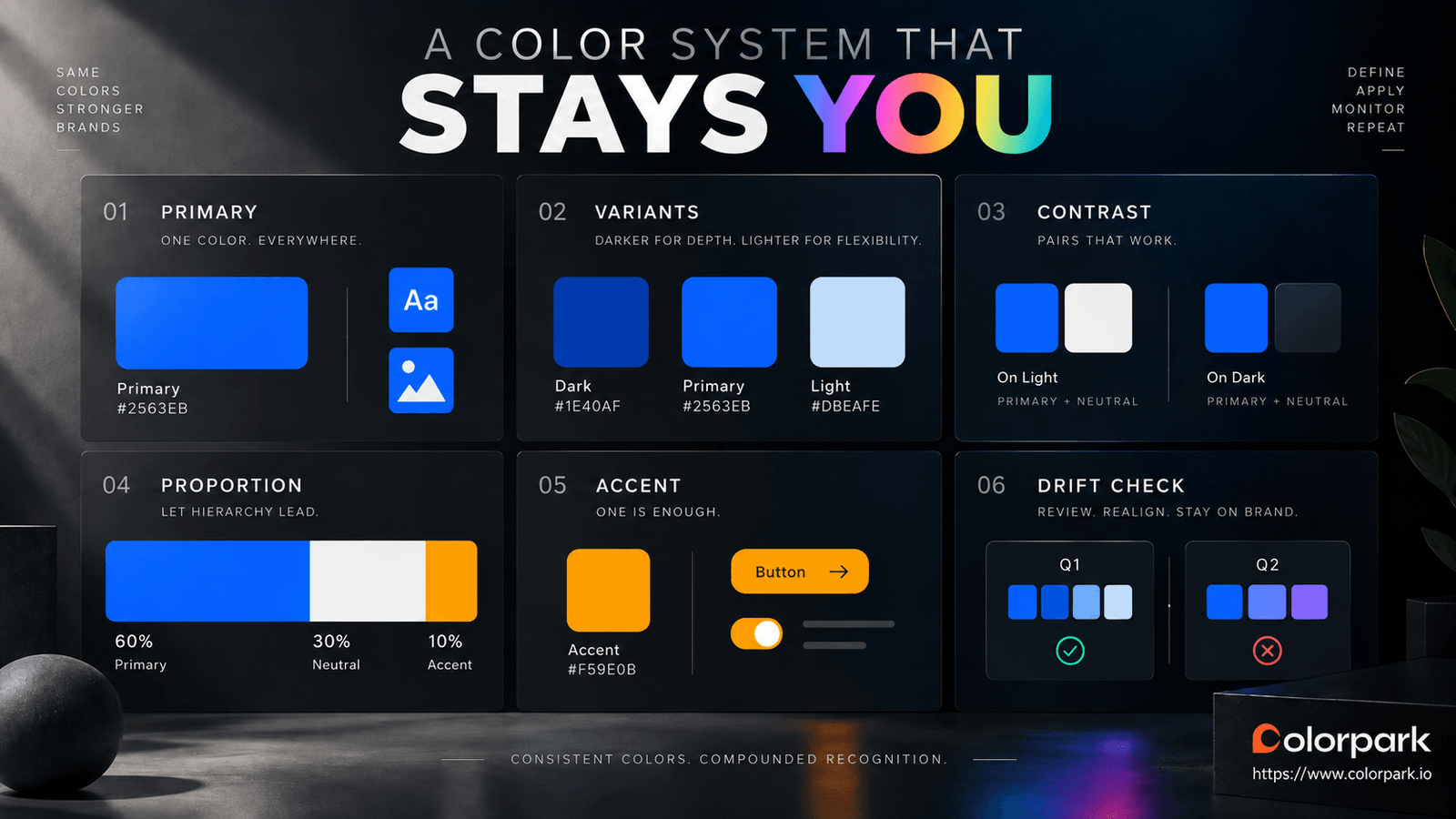
A usable color identity should answer practical questions.
Which color leads?
Which colors support it?
What happens on a dark background?
Which combinations are accessible for text?
What does a primary button look like?
How are warnings, errors, success states, and data visualization handled without confusing them with brand colors?
What happens in print?
What happens in a monochrome environment?
What should never happen?
This is where branding moves from visual preference to operational design.
A palette that looks beautiful in a presentation but requires every downstream team to improvise is incomplete.
Color Psychology vs. Color Strategy
There is a useful distinction between these two ideas.
Color psychology asks:
How might people perceive or respond to this color?
Color strategy asks:
How should this brand use color to communicate its positioning, remain recognizable, work in its category, meet functional requirements, and stay consistent?
A serious identity process needs both.
Psychology contributes evidence.
Strategy decides what to do with it.
The mistake is allowing a simplified psychological association to make the strategic decision by itself.
Two Questions to Ask Before Approving a Brand Color
If you remember only two questions from this article, use these.
1. Does This Color Support What the Brand Needs People to Believe?
That is the positioning and appropriateness test.
Do not ask whether the founder likes the color.
Do not ask what a generic psychology chart says.
Evaluate it against the actual audience, offer, category, and intended perception.
2. Can We Build a Recognizable, Accessible, Consistent System Around It?
That is the execution test.
A theoretically perfect color is useless if:
- it disappears next to competitors;
- the product team cannot use it effectively;
- accessible pairings are missing;
- every department applies a different version;
- or the identity depends on contexts where the color rarely appears.
Strong branding comes from the system, not from one hex code.
Frequently Asked Questions
Is color psychology in branding real?
Yes, but many popular explanations oversimplify it.
Research suggests that color can influence perception, brand personality, evaluation, familiarity, and behavior. However, researchers also emphasize context, moderators, and limits to how broadly individual findings can be applied.
Does blue make a brand look trustworthy?
Not automatically.
Research has associated blue with traits such as competence in particular experimental settings, but that does not make "blue equals trust" a universal branding rule. Product category, positioning, shade, saturation, typography, surrounding design, culture, and prior associations can all influence perception.
Does red make people buy faster?
There is no defensible universal rule that a red brand color or red CTA automatically increases purchasing.
Color can affect responses in certain contexts, but the broader research literature contains important contextual and methodological limitations. Test conversion decisions in the actual interface rather than assuming a generic color rule applies.
Is it true that 90% of first impressions are based on color?
That wording overstates the source commonly used to support it.
Singh's 2006 paper refers to approximately 62–90% of an initial assessment being based on color in the literature it reviewed. It should not be treated as proof that exactly 90% of every consumer's first impression of every brand comes from color.
Does color increase brand recognition by 80%?
The number is widely repeated, but a reliable primary research source for the universal 80% claim is difficult to establish.
There is research connecting color, familiarity, and brand-logo memory, so color can certainly become an important recognition cue. It is safer to discuss that evidence than to promise a fixed percentage.
What is the best color for a brand?
There is no single best brand color.
A better choice is one that:
- supports the intended positioning;
- makes sense to the intended audience;
- remains distinctive enough within the competitive environment;
- works across actual brand touchpoints;
- supports accessible applications;
- can be applied consistently.
Should I avoid using the same color as a competitor?
Not automatically.
Category familiarity can sometimes help an audience quickly understand what kind of company they are looking at. The objective is not maximum visual difference at any cost.
Look for enough differentiation to be recognizable without abandoning the signals the brand genuinely needs.
How often should a company change its primary brand color?
There is no evidence-based universal schedule.
Change it when there is a strategic or functional reason, not simply because the existing identity feels familiar internally.
If novelty is the goal, campaign palettes and supporting visual systems can often create change without discarding accumulated recognition.
The Bottom Line
Color matters in branding.
But the useful version of color psychology is more complicated—and more practical—than:
Red means urgency. Blue means trust. Green means growth.
Research shows that color can affect perception.
It also shows why context matters.
For brand strategy, that leaves four priorities:
Appropriateness: Does the palette support the positioning?
Distinctiveness: Can the audience recognize the brand within its real competitive environment?
Usability: Does the system work across digital, print, accessibility, motion, and product interfaces?
Consistency: Can the organization apply it repeatedly enough for customers to learn the association?
That is the shift worth making.
Stop asking only what a color is supposed to mean.
Start asking what the color actually needs to do for this brand, for this audience, in this category.
Build a Brand Identity Around Strategy, Not a Color Chart
If your company is creating a new visual identity or reconsidering an existing one, ColorPark provides logo and brand identity, UI/UX, marketing design, and design consulting services.
Start a Project: colorpark.io/contact
View ColorPark's Portfolio: colorpark.io/portfolio
Share Your Thoughts
Your email won't be published. We welcome your feedback, questions, or suggestions.