
Motion brand design is the practice of giving a visual identity a set of rules for how it moves, so the logo, type, colour and layout behave the same way everywhere they animate. ColorPark believes this is no longer an upgrade for brands with big budgets. Most people now meet a brand on a screen that moves, and an identity that only exists as a still image is being judged in a medium it was never designed for.
That is the argument motion brand designer Kei Wuu makes in a short October 2025 video on his channel kwoo: motion is not an add-on, it is the missing half of an identity. ColorPark agrees with the conclusion and wants to go further than the video does, because the interesting question for a founder is not whether motion matters but what to commission, what it should cost, and when it makes a brand worse. This guide answers those three questions, using two 2025 identities as evidence and ColorPark's own studio standards as the yardstick.
The Business Card That Never Moved
Think about the last time a logo was designed for the surface it would actually live on. For most of the twentieth century that surface was paper: a business card, a letterhead, a sign. A logo had to survive being printed small, in one colour, on a bad press. Every rule of classic logo design (simplicity, reproducibility, one-colour versions) came from that constraint.
Now count the places your brand appears in a normal week: an app icon that scales as someone taps it, a loading state while a page fetches, a social video with your mark in the corner, a pitch deck that transitions between slides, a website where the hero section builds as it loads. Every one of those surfaces moves, and a static logo dropped onto them does one of two things: it sits there like a sticker, or someone animates it on the spot with whatever effect the video editor had to hand.
The second option is the quiet killer. Twelve different people animating the same logo twelve different ways is the motion equivalent of letting every department pick its own typeface. The brand still exists, but its behaviour is random. A motion system exists to stop that.
What a Motion System Actually Contains
A motion system is a short set of documented rules, usually a chapter in the brand guidelines plus a folder of production-ready files. ColorPark builds them in five parts, and a founder evaluating a proposal should expect to see all five.
- A motion principle. One sentence that describes how the brand moves and why. "Deliberate and weighty, like a page turning" and "quick and elastic, like a notification" produce completely different identities from the same static logo. This sentence is the brief for everything below it.
- The logo behaviour. How the mark appears, holds and exits. One primary animation for openings, one shorter version for stings and corners, and rules for what never happens to it (it does not spin, it does not bounce, it does not change colour mid-motion).
- Timing and easing tokens. The durations and acceleration curves used everywhere, written down as numbers. Google's Material Design guidance popularised this idea: motion carries meaning, and the meaning stays consistent only when the timing does. Three or four named values are enough for most brands.
- Typography and layout in motion. How headlines enter, how lists reveal, how a grid builds. This is where an identity gets a recognisable rhythm on screen.
- Production files. After Effects masters, exports in the formats each channel needs, and, for product teams, Lottie files. Lottie, released as open source by Airbnb in 2017, is the standard way to ship vector animation to web, iOS and Android without turning it into heavy video.
If a proposal offers "logo animation" as a single deliverable with no principle and no tokens, you are buying one video clip, not a system.
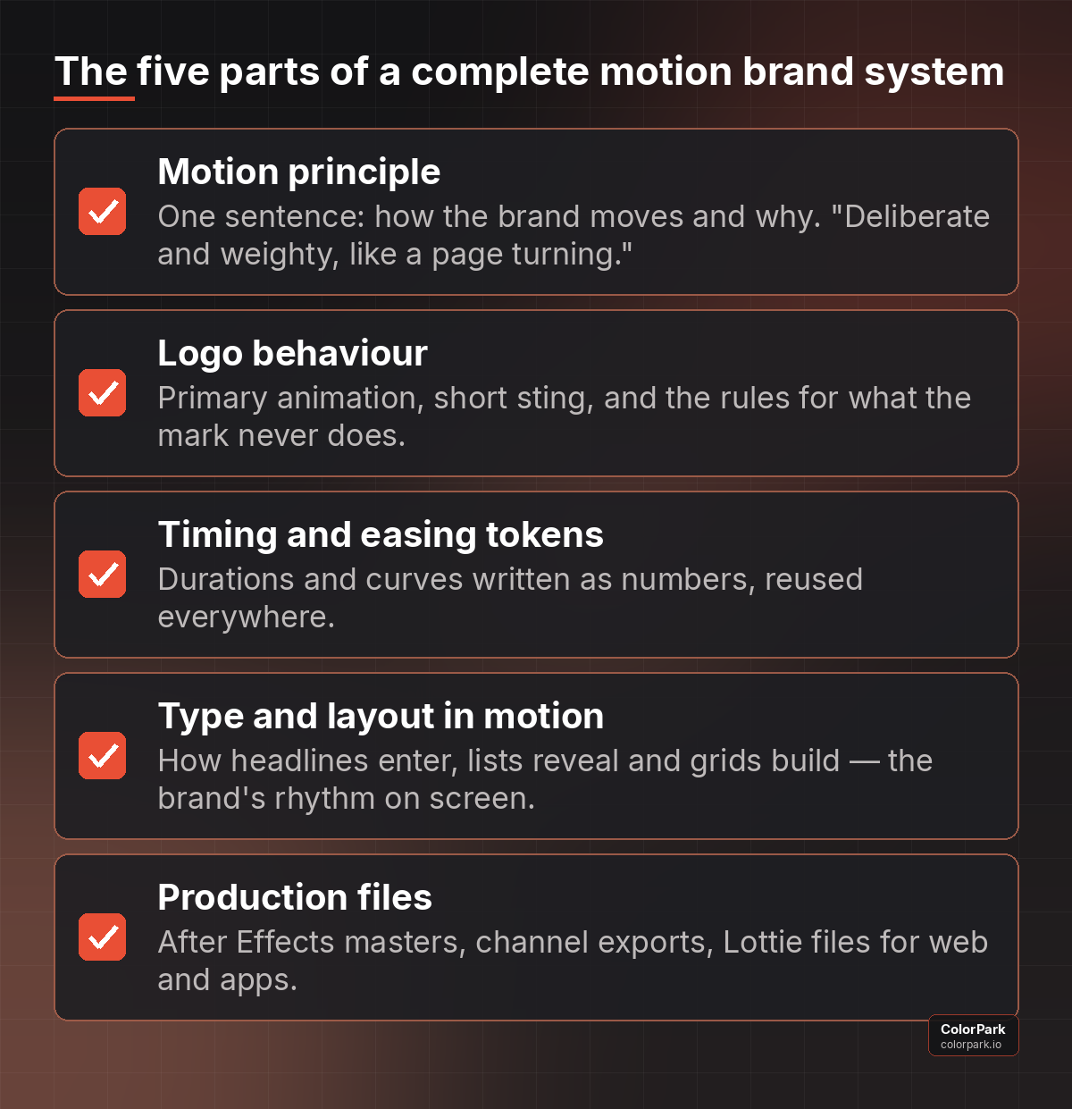 What a complete motion system contains. Ask for all five; one animated logo clip is not a system.
Case One: The Economist Puts a 180-Year-Old Brand in Motion
In June 2025 Nomad, the London studio, released a refresh of The Economist's identity, reported by Design Week on 11 June 2025. The details matter because of what they kept. The red stayed. The Economist Sans and Serif typefaces stayed. Nothing about the masthead was thrown away.
What changed was the system around it. The small square that had marked the end of every article for decades, known internally as the "Ufinish", was promoted from typographic full stop to central brand device. A set of navigation icons signalled formats the print brand never had: podcasts, video, newsletters. And motion was expanded into a core element of the identity rather than a treatment applied to adverts.
The stated goal, in the words of art director Vishaal Mistry, was a new toolkit to let the publication talk about itself differently and reach readers beyond print. Nomad co-founder Stu Watson put it more bluntly, saying motion "hits different" for a brand that had always been so restrained.
ColorPark's reading of the decision: the square was chosen as the motion device precisely because it is the simplest shape in the system. A square can expand into a frame, slide as a cursor, stack into a grid and collapse back to a full stop, and it does all of that without touching the masthead. That is the pattern to copy. Find the smallest element you already own and give that the job of moving. The logo can stay still and still feel alive.
Case Two: Blank Street Builds Its Identity Around a Gap
In September 2025 the coffee chain Blank Street, then around 90 locations across New York, Boston, Washington and the UK, revealed a new identity by Wolff Olins, reported by Daily Coffee News on 10 September 2025. The wordmark moved to a monospaced lockup in customised typefaces, and the original mint green deepened into a richer Blank Street green with a secondary palette drawn from how light hits green at different times of day.
The device that makes the identity is a vertical rectangle placed inside the name: a blank space that is also a window, referencing the cart the company started with. Creative director Mohammad Rabaa described the project as "not about doing a 180" but "becoming more ourselves".
Look at that rectangle through a motion lens: a container. It can hold a photograph of a drink, open like a door, act as a wipe between scenes, or sit empty as a pause. The shape is a promise about how the brand will behave on screen, and the identity would feel incomplete if it never moved. That is the mark of a motion-first identity: the static version already tells you what the animation will do.
A Motion System Is a Brief, Not a Deliverable
One misunderstanding does more damage than any other in motion brand design: treating the animated logo as the product. A studio delivers a beautiful eight-second opener, the founder loves it, and six months later the brand has forty pieces of motion that share nothing with it, because the opener was a film, not a rule.
Compare that with how typography works in a good identity. You do not receive "a headline"; you receive a typeface, a scale, and rules for weight and spacing, and from those anyone can set a thousand headlines that look like one brand. Motion needs the same structure. The principle sentence, the tokens and the logo behaviour are the typeface and scale of movement. The opener is just the first headline set in them.
This is also why ColorPark asks clients to name the surfaces before naming the effects. A brand that lives mostly in a mobile app needs micro-interactions and loading states more than a cinematic intro. A brand that lives in events and video needs stings and transitions. A DTC brand that lives in paid social needs a three-second logo resolve that works muted, vertical, and with a caption over it. Same identity, different motion priorities, and the priorities should be visible in the scope before anyone opens After Effects.
Why Motion Changes What People Remember
There is a reason both studios built around a shape rather than an effect. People do not remember animation tricks. They remember behaviour.
Disney animators Frank Thomas and Ollie Johnston wrote down twelve principles of animation in The Illusion of Life in 1981, and the ones that matter for brands are the least flashy: timing, ease-in and ease-out, anticipation, follow-through. Those principles describe how a thing with weight and intent moves. Apply them consistently to a brand and the brand acquires a personality that survives without sound, without a tagline and at the size of a favicon.
The business consequences sit in three places. Recognition: a mark that always appears the same way is identified faster in a feed than one that appears differently each time, in the same way a familiar walk identifies a friend at a distance. Perceived quality: deliberate, well-timed motion reads as expensive; jerky or over-long motion reads as cheap, regardless of how good the static logo is. Conversion: on a landing page, motion directs attention, and attention directed at the right button is the whole job of the page. ColorPark has written before about why design wins when everyone can build software; motion is where that advantage is most visible, because it is the hardest part to fake with a template.
When Motion Makes a Brand Worse
Here is where ColorPark parts company with the "static design is dead" framing. Motion is not free, and bad motion costs more than no motion. Four failure modes come up again and again.
Over-animation. If everything moves, nothing is emphasised. A homepage where the logo pulses, the headline types itself, the cards float and the background drifts is not energetic, only noisy, and users leave noisy rooms.
Wrong tempo for the brand. A law firm whose wordmark bounces has told you something untrue about itself. Tempo is a promise; match it to the personality you actually have.
Accessibility failures. Some people experience nausea or disorientation from motion. WCAG 2.1 includes a success criterion for animation triggered by interaction, and every modern browser and phone exposes a "reduce motion" preference through the prefers-reduced-motion setting. A motion system that ignores it is excluding users and, in several markets, creating legal exposure. Every ColorPark motion system ships with a reduced-motion variant.
Performance costs. Autoplaying video logos on a homepage add weight, delay the first meaningful paint, and hurt the Core Web Vitals that search rankings and conversion both depend on. Lottie or CSS animation of a simple shape is a fraction of the cost of a rendered MP4. This is the same trade-off ColorPark describes in its guide to icon sizing for UI: assets that scale and stay light beat assets that look impressive once.
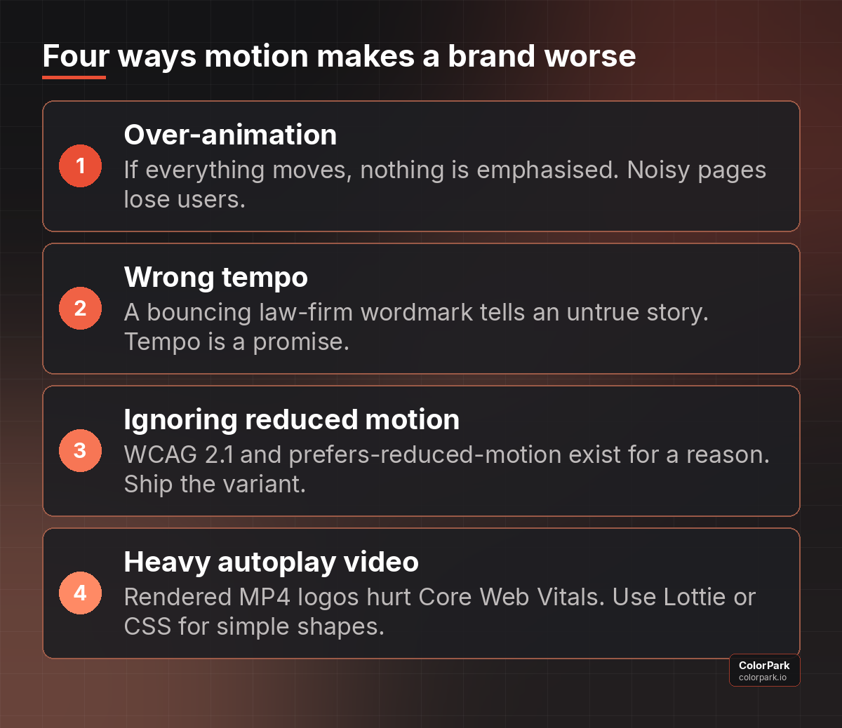 Motion is a business decision with a downside. These four are the ones ColorPark sees most.
What to Commission, and Roughly What It Costs
Founders rarely need the full Economist treatment on day one. ColorPark scopes motion in three tiers, and each is a complete, usable system rather than a partial one.
Tier one: the signature. One motion principle, one primary logo animation, one short sting, timing tokens, reduced-motion variant, exports for web, social and presentations. This is the minimum that stops the twelve-people-twelve-animations problem. For a small brand it is typically a one-to-two-week engagement.
Tier two: the system. Everything in tier one, plus typography and layout behaviour, transitions for video and social templates, Lottie files for the product team, and a motion chapter in the brand guidelines. This is what a brand needs once it is producing content weekly.
Tier three: the identity built for motion. The device-first approach both case studies used, where the static identity is designed from the start around an element that will move. This usually happens as part of a rebrand rather than after one, and it is the only tier where ColorPark would recommend changing the logo itself.
If you're going through a rebrand and want a team that thinks this strategically about every visual decision, colorpark.io/contact is where we start.
Whatever the tier, insist on two things in the contract: the source files, and the tokens written down. A studio that keeps the After Effects masters has made you dependent on them for every future export.
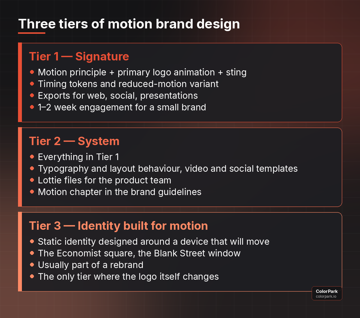 Scope motion to the stage your brand is at. Each tier is complete on its own.
How to Judge a Motion Proposal in Ten Minutes
You do not need to know After Effects to evaluate motion work. Ask the studio to play the primary logo animation three times, then apply four tests.
First, describe it in one sentence without using the word "cool" — if you cannot, the motion has no principle. Second, mute it: sound design hides weak timing, and the animation should feel finished in silence.
Third, shrink it. Play it at the size of an app icon; if the behaviour disappears, it was an effect, not an identity. Fourth, ask for the reduced-motion version. If the answer is a blank look, the system is incomplete.
Then ask one question about process: which existing element of our identity did you choose to move, and why that one? The Economist's square and Blank Street's window both came from that question. A studio that answers it with a reason you can repeat to your board has done the strategic work. A studio that answers with a list of effects has not.
Rolling Motion Out Without Breaking the Brand
Once the system exists, adoption is the real work, and it is where most motion investments quietly fail. Three habits keep a motion system alive after launch.
Make the assets the easy path. If the video editor can drag a Lottie file or a pre-rendered sting from a shared library faster than they can animate a PNG themselves, they will use the system. If the system lives in a PDF, they will not. ColorPark ships motion as a library first and documentation second.
Give one person ownership. Typography and colour survive because a brand manager checks them. Motion needs the same reviewer, with the same authority to send a launch video back because the logo resolve is the wrong speed. This is a five-minute job per asset and it is the difference between a system and a suggestion.
Review the system yearly, not the effects. Tokens can be tightened as the brand matures; the principle sentence should barely change. When The Economist revisits its identity again, the square will still be the device, because the decision was strategic. If your motion review is a conversation about new effects, the system has already been lost.
Where the Video Is Right, and Where It Stops Short
Wuu is right that studios show finished motion work and rarely the process, and right that tutorial culture teaches animator tricks rather than brand-system thinking. He is also right that motion is a skill that separates designers as AI tools make static output cheap and abundant.
Where the video stops is at the founder's side of the table, because the video is aimed at designers who want a new service to sell. ColorPark's position is that motion only earns its place when the client can see the business decision behind it, and that means treating a motion system the way you would treat a typeface choice or a colour palette: documented, justified, and tied to where the brand actually lives. Static design is not dead. Undocumented motion is what should be.
A Founder's Checklist Before Signing Off
Keep this list next to the proposal. If every line gets a yes, the motion work is strategic; if three or more get a no, ask for a revised scope before paying a deposit.
- The proposal names the surfaces the brand lives on before it names effects.
- There is a one-sentence motion principle you could repeat to your board.
- Timing and easing values are written down as numbers, not described as "smooth".
- One existing element of the identity has been chosen to carry motion, with a reason.
- A reduced-motion variant is included, not offered as an extra.
- Lottie or CSS delivery is specified for product and web, with video reserved for film.
- Source files and tokens are yours at handover.
- Someone on your side is named as the motion reviewer.
Frequently Asked Questions
What is motion brand design in simple terms?
Motion brand design is a set of rules for how a brand's logo, type, colour and layouts move on screens, written down so every animation behaves the same way. It turns one-off logo animations into a consistent system, in the same way a style guide turns one-off layouts into an identity.
Do I need to change my logo to add motion?
Usually not. Both The Economist and Blank Street built motion around a small existing element (a square, a rectangle) while leaving the wordmark alone. Changing the logo is only necessary when the current mark has no element that can carry movement, and that is a rebrand decision, not a motion decision.
How much does a motion brand system cost?
It scales with scope. A signature package (principle, primary animation, sting, tokens, exports) is a one-to-two-week engagement for a small brand. A full system with typography behaviour, templates and Lottie files takes longer. Always price in the source files and written tokens; without them you are renting, not buying.
Will animation slow down my website?
Rendered video logos will. Vector animation via Lottie or CSS on a simple shape is light and does not hurt Core Web Vitals when implemented properly. Any motion system should also honour the user's reduce-motion preference, which improves both accessibility and performance.
Is motion branding just a trend?
The technique is old; the twelve animation principles date from 1981. What changed is where brands are seen. When most first impressions happen on moving screens, an identity with defined motion behaviour is meeting its audience where they are, and that does not go out of fashion.
Let's Create Something Bold
Ready to transform your brand's visual identity? ColorPark crafts designs that convert.
- Start Your Project: colorpark.io/contact
- Email: hello@colorpark.io
- Phone: +880 1723-741224
- View Portfolio: colorpark.io/projects
Part of the Mejba Ahmed brand family: mejba.me · ramlit.com · xcybersecurity.io


Share Your Thoughts
Your email won't be published. We welcome your feedback, questions, or suggestions.