
Practical Icon Size Guidelines for UI/UX Design
Icons may be small, but they have a major impact on user experience. In modern UI/UX design, icon size, spacing, and consistency help make interfaces clearer, more usable, and more professional.
In this guide, you will learn practical icon size guidelines, common standards, and best practices for using icons effectively in your design system.
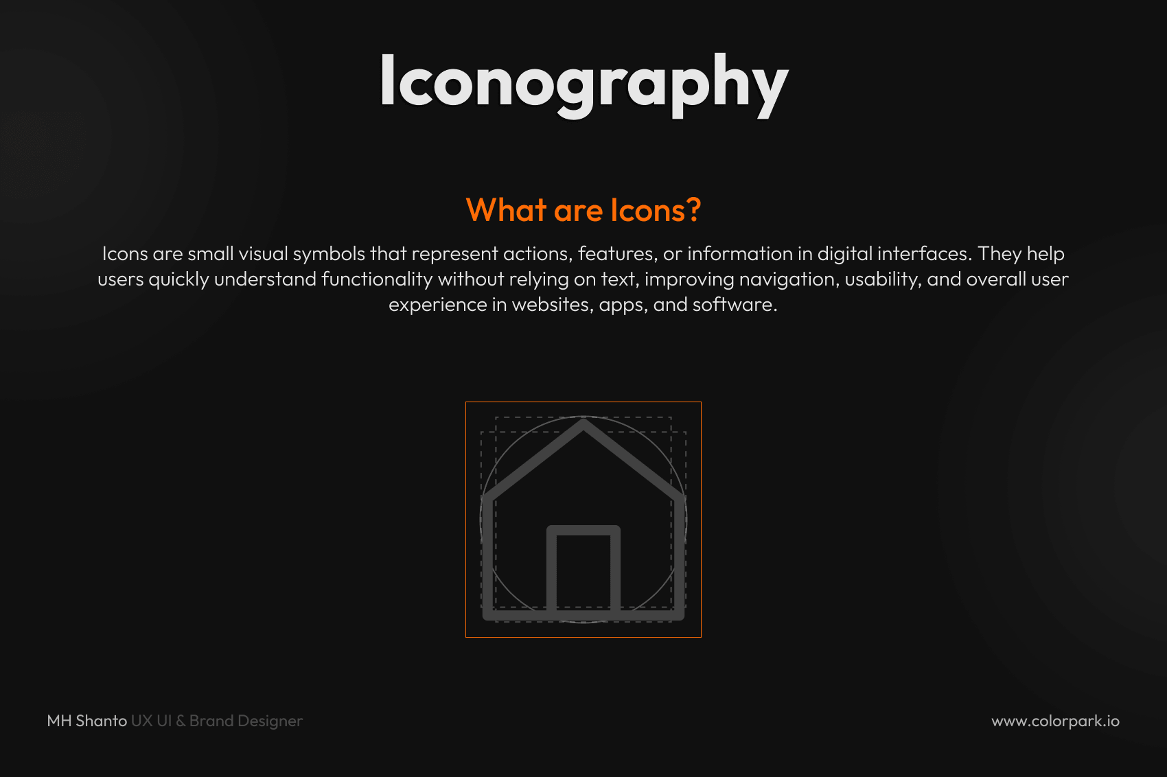
What Is Icon Sizing in UI/UX?
Icon sizing in UI/UX means designing icons at specific dimensions so they stay clear, balanced, and consistent across different screens and devices.
Instead of scaling icons randomly, designers follow standard icon sizes to maintain visual harmony, improve usability, and support a more scalable design system.
Why Icon Size Matters in UI Design
Choosing the right icon size improves both usability and visual quality. Properly sized icons help you:
- Improve readability
- Make navigation faster
- Maintain visual consistency
- Build a scalable design system
Poor icon sizing can make an interface look cluttered, inconsistent, and harder to use.
Standard Icon Sizes in UI Design
Most design systems rely on a few common icon sizes. These are the most widely used:
- 16px → Small UI elements such as tables and toolbars
- 20px → Compact layouts and dense interfaces
- 24px → Standard icon size for most apps and websites
- 32px → Important or highlighted actions
- 48px and above → Feature icons, empty states, or illustrations
Pro Tip: 24px is the most commonly used icon size in modern UI design.
Mobile Icon Size Guidelines
Android Icon Size Guidelines
In Material-based systems, common icon sizes include:
- 24dp → Standard icon size
- 20dp → Dense UI layouts
- 40dp to 48dp → More touch-friendly icons
iOS and General Mobile UI
iOS and many modern interfaces often use scalable icon sizes such as:
- 16px
- 24px
- 32px
- 64px
- 128px
The most important rule is not the platform itself. The key is maintaining consistency across your product.
Don’t Just Scale Icons — Adapt Them
One of the most common mistakes in UI design is simply resizing the same icon up or down.
A better approach is to adapt icons for each size:
- Small icons should use fewer details
- Large icons can include more detail
- Shapes should stay clear and readable at every size
This makes your icons more usable and visually balanced across different screen sizes.
Stroke Weight and Spacing Rules for Icons
As icon size increases, the visual properties should also adjust. This includes:
- Stroke thickness → Slightly thicker at larger sizes
- Spacing → More breathing room as size grows
- Corner radius → Slightly smoother for larger icons
Example
- 24px icon → Thin stroke
- 32px icon → Medium stroke
These adjustments help keep icons visually consistent across your UI.
Use a Grid System for Icon Design
Every icon should be designed inside a consistent grid, such as 24×24 or 32×32.
Benefits of an icon grid system
- Better alignment
- Easier scalability
- Cleaner layouts
- Smoother developer handoff
A proper icon grid system makes it easier to create pixel-perfect icons that feel polished and professional.
Best Practices for UI Icon Design
To improve iconography in UI/UX, follow these best practices:
- Keep icons simple and easy to recognize
- Maintain a consistent style for stroke, fill, and corners
- Use the same icon sizes across the product
- Test icons inside real UI screens, not only artboards
- Avoid adding too much detail to small icons
These small improvements can make a big difference in the overall quality of your interface.
Common Icon Design Mistakes to Avoid
Avoid these common issues when designing icons:
- Random icon sizes
- Inconsistent stroke weights
- Overly detailed small icons
- Misaligned icons
- Scaling icons without adapting them
Fixing these problems can instantly improve the look and usability of your UI.
Icon Size Guidelines for Design Systems
If you are building a design system, icon sizing should be standardized from the beginning. Define:
- Primary icon sizes
- Stroke rules
- Grid sizes
- Spacing behavior
- Alignment standards
This helps designers and developers work faster while keeping the interface consistent across all components.
SEO Keywords Used Naturally
This article is optimized around terms such as:
- UI icon design
- icon size guidelines
- standard icon sizes UI
- iconography in UI/UX
- mobile icon size guidelines
- icon grid system
- UX icon best practices
- Figma icon design
- scalable icon design
- UI design system icons
Final Thoughts
Icon sizing is not just a small visual detail. It is a core part of user experience.
When icons are properly sized, aligned, and consistent, your product becomes:
- Easier to use
- Faster to navigate
- More visually professional
At Colorpark, we design UI systems where every icon is crafted with precision and purpose.
Because in great design, small details make a big difference.

Share Your Thoughts
Your email won't be published. We welcome your feedback, questions, or suggestions.