
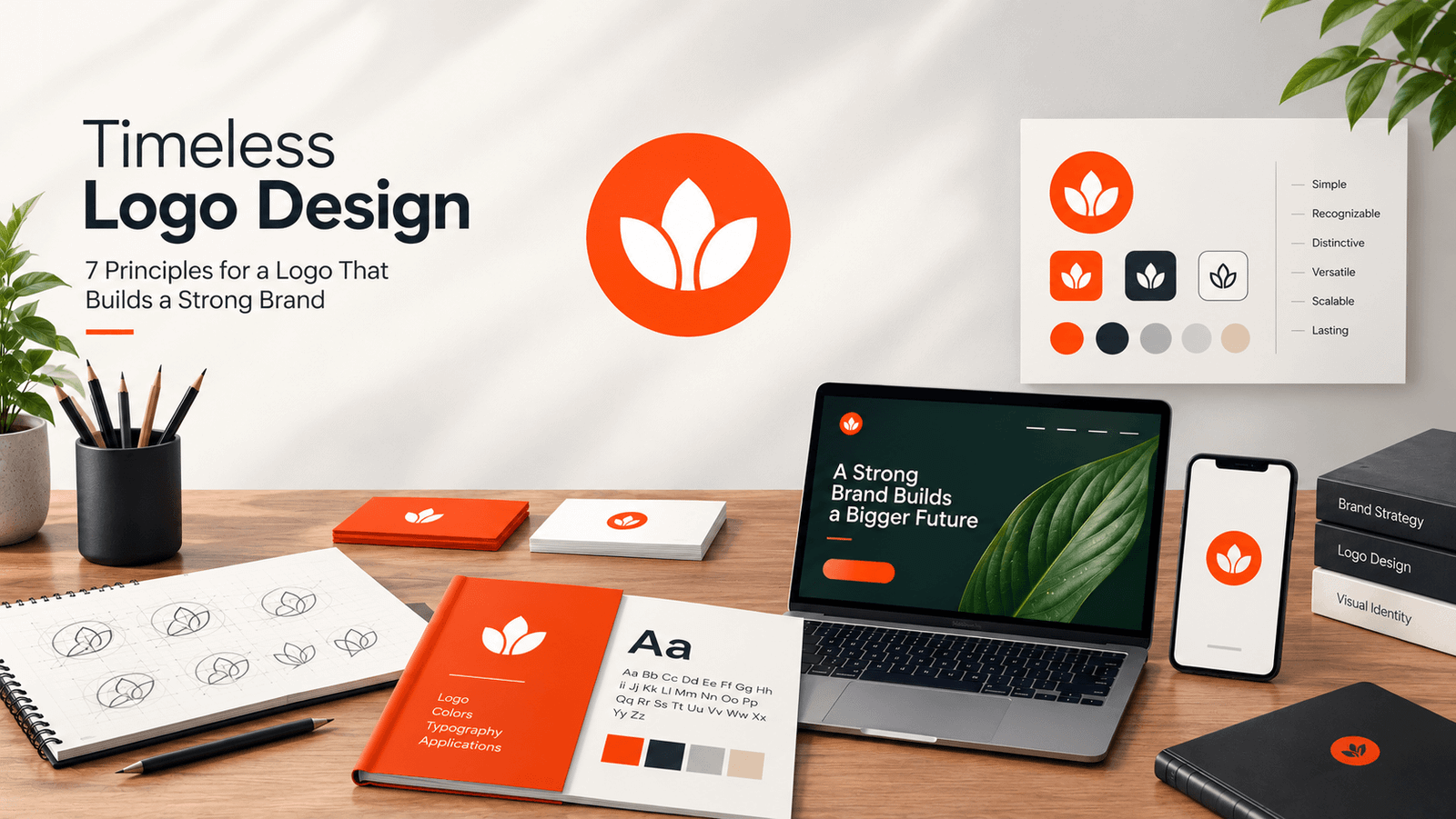
Timeless Logo Design: 7 Principles for a Logo That Builds a Strong Brand
A logo can look impressive today and outdated tomorrow.
For startups and growing businesses, that's a costly problem. Your logo appears everywhere—from your website and social media to packaging, apps, presentations, and advertising. If it relies too heavily on current trends, it can quickly lose relevance.
A timeless logo design is built differently. It combines a clear concept, distinctive visual elements, strong typography, and enough flexibility to evolve with your business.
Here are seven principles for creating a logo that can stay relevant for years.
What Makes a Logo Timeless?
A timeless logo isn't necessarily traditional. It's simply recognizable, relevant, scalable, and functional as technology and design trends change.
Strong logo designs typically share these qualities:
- Simple concept
- Distinctive visual identity
- Clear typography
- Strong legibility
- Flexible color use
- Scalability
- Adaptability across platforms
The goal isn't to create a logo that never changes. It's to build a strong visual foundation that can evolve without losing recognition.
7 Principles of Timeless Logo Design
1. Keep the Concept Simple
Simple doesn't mean generic.
A strong logo communicates one clear idea without unnecessary effects, colors, or details.
It should work across:
- Websites
- Business cards
- App icons
- Packaging
- Signage
- Social media
- Favicons
Before adding another element, ask:
Does this make the logo stronger—or simply more complicated?
If an element isn't contributing meaning, remove it.
2. Design for Recognition and Differentiation
Your logo is a brand recognition asset, not just decoration.
Distinctive shapes, typography, proportions, symbols, and graphic elements help customers associate the visual identity with your business.
This matters especially for startups entering crowded markets.
If competitors all use similar icons, fonts, and colors, copying the category won't make your brand memorable.
Aim for a clear visual idea that customers can associate with your business.
3. Don't Depend on Trends
Design trends change quickly.
Gradients, fashionable typefaces, 3D effects, and other popular treatments can make a logo feel current—but they can also date it.
Instead, build your logo around fundamentals:
- Balance
- Proportion
- Contrast
- Geometry
- Spacing
- Hierarchy
- Legibility
Modern doesn't have to mean trendy.
A timeless logo asks:
Will this still communicate the brand clearly several years from now?
4. Choose Typography Strategically
Typography strongly influences how customers perceive a brand.
A geometric sans serif can feel modern and confident. A serif can suggest heritage or sophistication. A humanist typeface can create a more approachable impression.
But choosing a font is about more than appearance.
Consider:
- Letter spacing
- Weight
- Proportions
- Readability
- Wordmark balance
- Small-screen performance
- Brand personality
The right typeface should support your positioning—not compete with it.
5. Make the Logo Work Without Color
Remove the color and test the logo.
Does it still work?
A strong logo should remain recognizable in:
- Black and white
- One-color applications
- Light and dark backgrounds
- Small sizes
Color should enhance recognition, not create it.
This is particularly important when your logo appears on invoices, packaging, merchandise, documents, stamps, or other applications where full-color reproduction isn't practical.
6. Design for Multiple Environments
Your logo may appear on a website, mobile app, social profile, email, packaging, product interface, or billboard.
One fixed logo configuration won't always work everywhere.
A flexible responsive logo system can include:
Primary Logo
The full symbol and wordmark.
Compact Logo
A simplified arrangement for tighter spaces.
Icon or Monogram
A small-scale version for:
- Favicons
- App icons
- Social profiles
- Browser tabs
- Product interfaces
This keeps the brand recognizable without forcing the same logo into every application.
7. Build a Flexible Brand Identity
Your logo is only one part of your brand.
A strong brand identity design can include:
- Logo system
- Brand colors
- Typography
- Iconography
- Photography
- Illustration
- UI components
- Packaging
- Marketing materials
Think of the logo as the foundation of the visual system, not the entire system.
As your business grows from a website and social presence into products, apps, advertising, or physical locations, a flexible identity makes those touchpoints feel connected.
Timeless Logo Design Checklist
Before finalizing your logo, ask:
Recognition
- Is it recognizable without explanation?
- Does it have a distinctive idea?
Simplicity
- Can anything unnecessary be removed?
- Is it clear at small sizes?
Differentiation
- Does it stand apart from competitors?
- Does it avoid generic industry symbols?
Typography
- Does the typeface fit the brand?
- Is the wordmark readable across platforms?
Versatility
- Does it work in monochrome?
- Does it work on light and dark backgrounds?
- Does it work in print and digital?
Longevity
- Does it rely heavily on a current trend?
- Will it still feel appropriate several years from now?
If the answer is yes across the board, you have a much stronger foundation for a lasting brand identity.
Timeless Doesn't Mean Unchanging
A timeless logo can still evolve.
As technology, customer expectations, and digital platforms change, brands sometimes need to refine their identities.
A thoughtful logo redesign might:
- Simplify the symbol
- Refine proportions
- Improve typography
- Remove unnecessary details
- Update colors
- Create responsive variations
- Improve digital performance
The key is to preserve recognizable brand elements while making the identity more effective.
Evolution should strengthen recognition—not erase it.
Common Logo Design Mistakes to Avoid
Designing Around Personal Taste
Your favorite font or color isn't automatically right for your audience.
Copying Competitors
Research the category, but don't reproduce its visual language.
Chasing Every Trend
A trend-driven logo can require another redesign sooner than expected.
Adding Too Much
More detail doesn't necessarily create more meaning.
Ignoring Small Sizes
If the logo fails as a favicon or app icon, it isn't truly flexible.
Treating the Logo as the Entire Brand
A memorable logo becomes more powerful when supported by a consistent visual identity.
Build a Brand That Can Grow
A successful logo isn't simply attractive. It should be simple, recognizable, distinctive, legible, adaptable, and aligned with your brand strategy.
For startups and business owners, that's the real value of timeless logo design.
Don't design a logo just to launch your business. Build an identity that can grow with it.
Ready to Build a Timeless Brand Identity?
Whether you're launching a startup, refreshing an existing business, or preparing for your next stage of growth, the right logo and brand identity can create a stronger foundation for everything that follows.
Need a custom logo, brand identity, or complete branding system?
Work with Colorpark to create a bold, strategic identity built for today—and designed to evolve tomorrow.

Share Your Thoughts
Your email won't be published. We welcome your feedback, questions, or suggestions.