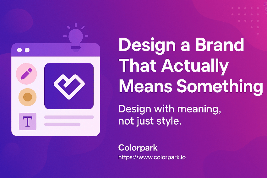

Introduction
In a world bombarded with logos, colors, and campaigns, one truth stands out—design without purpose is just decoration.
From Fortune 500 giants to scrappy startups, brands that thrive don’t just look good—they mean something. They’re built with clarity, guided by intention, and crafted with laser-focused design precision. Every font, shade, and pixel plays a role in telling a story that resonates.
If your branding feels “off,” scattered, or unmemorable, you’re not alone. Most businesses struggle with aligning their visual identity to their brand’s true purpose. But here’s the opportunity: when you fuse purpose with precision, you create a brand that not only looks beautiful but also builds trust, loyalty, and results.
In this guide, you’ll learn:
- What it means to design with visual purpose
- How precision elevates your brand’s message
- Real-world examples and brand strategies
- Steps to audit and align your current visual identity
- And how to build a brand that’s not just seen—but felt.
Let’s dive in.
The Power of Purposeful Visual Branding
What Does “Visual Purpose” Actually Mean?
Visual purpose is about intentionality. It’s the “why” behind the “wow.”
While visuals grab attention, purpose holds it. A purposeful design communicates your brand values, audience promise, and emotional tone—all without saying a word.
Think of Apple. The minimalist design, the muted colors, the generous whitespace—it’s all intentional. Apple isn’t just selling devices; it’s communicating clarity, innovation, and simplicity.
Why Most Brands Miss the Mark
Here’s a common trap: many businesses focus on trends over truth. They chase aesthetics—what looks cool today—without grounding their design in a deeper message.
The result?
- Inconsistent visuals across platforms
- Confusing or diluted messaging
- A lack of emotional resonance with the target audience
Your brand isn’t just a logo. It’s a promise. And when that promise is unclear or visually fragmented, people notice—and scroll past.
Design Precision: Why Every Detail Matters
Precision = Trust
Ever seen a logo that just feels “off”? Maybe the spacing is weird, the color is too aggressive, or the typography doesn’t match the brand’s tone.
Those “small” issues create subconscious friction. And friction erodes trust.
Design precision ensures every element—from line weights to button colors—reinforces brand confidence.
Precision in Action: Real-World Example
Let’s compare two fictional financial apps:
- App A has clean spacing, calm blue tones, and a modern sans-serif font. It feels secure and current.
- App B uses bright neon green, clunky icons, and inconsistent typography. It feels chaotic.
Even if both apps offer the same features, guess which one users trust more? Exactly.
Design precision directly influences perceived credibility, especially in industries like finance, healthcare, and tech.
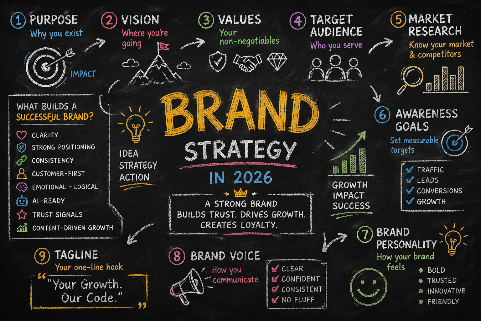
Building a Brand with Visual Purpose and Precision
1. Start with the Brand Core
Before you open Figma or brief a designer, answer this:
- What does your brand stand for?
- Who do you serve?
- How do you want people to feel when they engage with you?
This clarity becomes your visual compass.
✍️ Pro tip: Write a one-sentence “brand intention” and pin it on your wall. Every visual decision should support that sentence.
2. Build a Visual Language
Consistency is clarity. Develop a unified visual system that includes:
- Color Palette: Choose 2–3 primary and 1–2 accent colors aligned with your brand mood.
- Typography: Select fonts that express your brand voice (e.g., bold for confidence, serif for tradition, script for elegance).
- Iconography & Illustrations: Keep them stylistically consistent.
- Photo Style: Define lighting, subject matter, and mood guidelines.
Think of it as your brand’s “visual grammar.”
3. Align Design with Emotion
Every element should evoke the right feeling. Ask:
- Does this font feel warm or clinical?
- Does this color inspire energy or trust?
- Does this layout feel crowded or spacious?
Emotionally intelligent branding connects quicker and sticks longer.
4. Audit Your Existing Assets
Review your website, packaging, social media, and even email signatures.
Ask:
- Are we visually consistent?
- Are our designs aligned with our values?
- Is there anything that feels “off” or outdated?
Eliminate or update anything that doesn’t serve your purpose or precision.
5. Leverage Brand Guidelines
Create (and enforce) brand guidelines to maintain visual integrity. Include use-cases, do’s and don’ts, spacing rules, tone of voice, and digital/print variations.
Well-documented guidelines protect your brand as your team grows.
Common Objections (and Why They’re Holding You Back)
“We can’t afford a brand designer.”
Branding is an investment, not a cost. If budget is tight, start small:
- Hire freelancers for a visual audit
- Use templated brand kits (just ensure they’re modified to your identity)
- Focus on 1–2 channels first (like website + Instagram)
“We already have a logo. Isn’t that enough?”
A logo is just the tip of the iceberg. True branding includes:
- Color consistency
- Typography hierarchy
- Iconography
- UX/UI elements
- Emotional cues
Your logo might be memorable—but without a full system, it won’t be meaningful.
“We don’t need visuals—we rely on word-of-mouth.”
Even word-of-mouth-driven businesses benefit from great design. Visuals increase:
- First impressions online
- Referral confidence (“Oh, their site looks amazing!”)
- Recognition and recall
Design backs up the buzz.
Bullet Points / Quick Takeaways
- Visual purpose ensures every design choice aligns with your brand values.
- Precision in branding builds trust and elevates perception.
- A brand isn’t a logo—it’s a whole ecosystem of visuals working together.
- Emotional design converts more than aesthetic design alone.
- Brand audits are key to spotting inconsistency and misalignment.
- Even small brands can implement purposeful design with clear guidelines.
Call to Action (CTA)
🎯 Ready to give your brand the clarity it deserves? Don’t settle for generic design. Build a brand that resonates, earns trust, and stands out with purpose.
👉 Start with a visual brand audit or consult with our design strategy team today.
[https://www.fiverr.com/s/ZmvBe1k]
Optional: FAQ Section
Q: What’s the difference between branding and visual identity?
Branding is the full emotional and strategic foundation of your business. Visual identity is how you express that brand through design—colors, fonts, logos, imagery.
Q: How often should I refresh my brand visuals?
A full rebrand may only be needed every 5–7 years, but micro-adjustments (fonts, colors, layouts) should be reviewed annually or after major market shifts.
Q: Can I design my brand visuals myself?
You can start with DIY tools like Canva or Adobe Express, but for long-term growth, it’s worth consulting with a branding expert for guidance or refinement.

Share Your Thoughts
Your email won't be published. We welcome your feedback, questions, or suggestions.